Patient Health Record
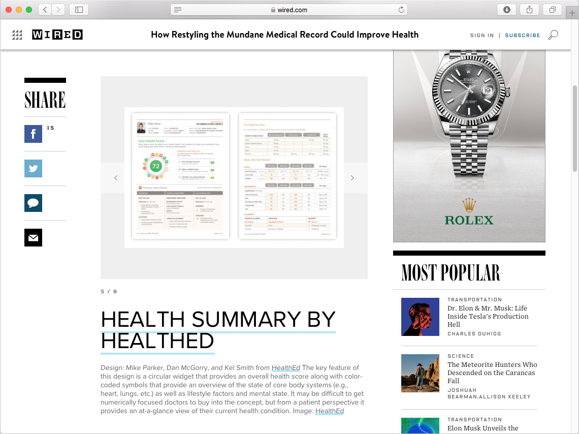
My Role
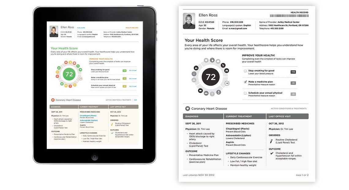
In just 2 weeks, our small team reimagined the Patient Health Record to be more readable, understandable, and helpful for the common user. We received a first-place honors from the Office of the National Coordinator of Health Information Technology and the Department of Veterans Affairs. My contributions included user research, strategy, design, and submission presentation.
Challenge
- Improve the visual layout and style of the information from the medical record.
- Create a human-centered design that makes it easier for patients to manage their health.
- Enable health professionals to more effectively understand and use patients’ health information.
- Help family members and friends care for their loved ones.
Process

Ideation
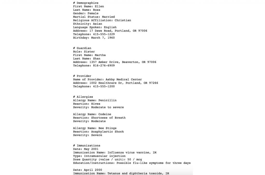
I assembled a lean team including myself, Dan McGorry – Designer Extraordinaire, and Tara Rice – Health Educator to work on the project. We started by reviewing and understanding all data points reflected in the current EHR.
Working Sessions
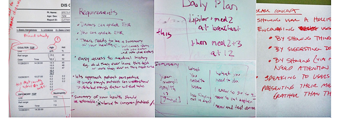
We aligned on objectives and target audience. We also brainstormed ways to meaningfully communicate problem areas and encourage behavior change to patients and their health care providers.
Strategy / Guiding Principles
From those sessions the following principles emerged and would guide our design throughout development:
- Understandability — a person of 8th grade reading ability should be able to easily scan, digest, and recount their health information without question or error.
- Holistic Interpretation — health is not 1-dimensional. Several related or separate factors could impacting a person’s health.
- Promote Action — it’s not enough to simply show factors that impact health, what to do about it should also included.
Sketching
Next, I evolved raw ideas into sketches, iteratively adding more fidelity as we reviewed, discussed, and worked to rationalize the health information priority and layout, system for communicating health status, and behavior change calls to action.


Validation
We reviewed our concepts with 4+ seasoned Health Educators and Registered Nurses with each iteration.

Refinement
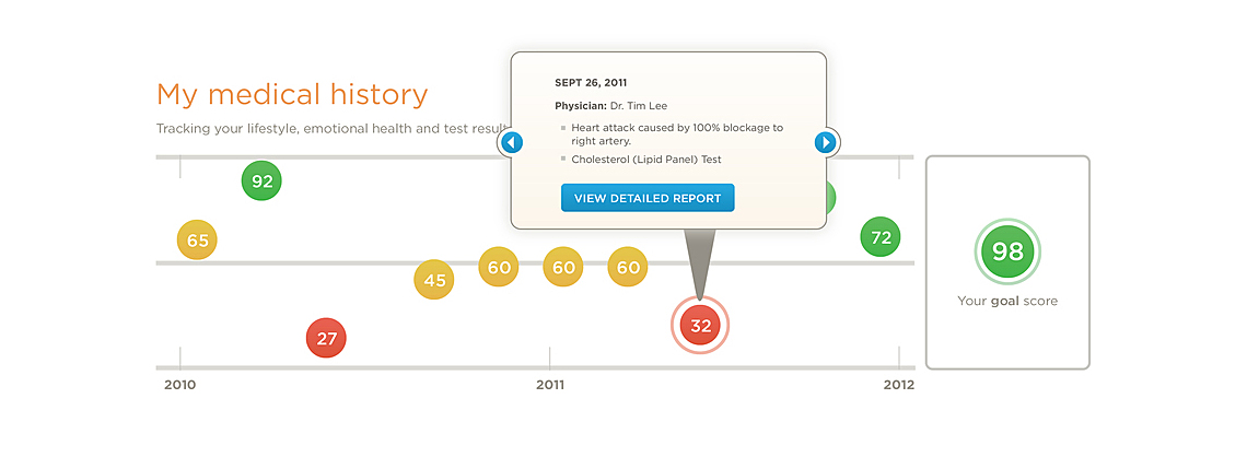
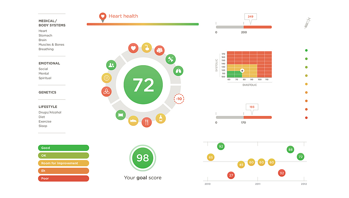
Worked closely with Tara and Dan to define the health factors and the algorithm which calculates the patient health score. We also refined health information and behavior change calls to action.


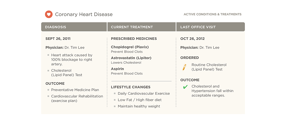


Result
- Our team was awarded 1st place for Best Lab Summaries.
- Elements of our winning design have influenced the redesign of our national patient health record.
- Several publications picked up our story and helped us broadcast our mission of improving health for all.